Renewable energy data visualization of 2023
Renewable Energy Data Visualization: A 2023 Perspective
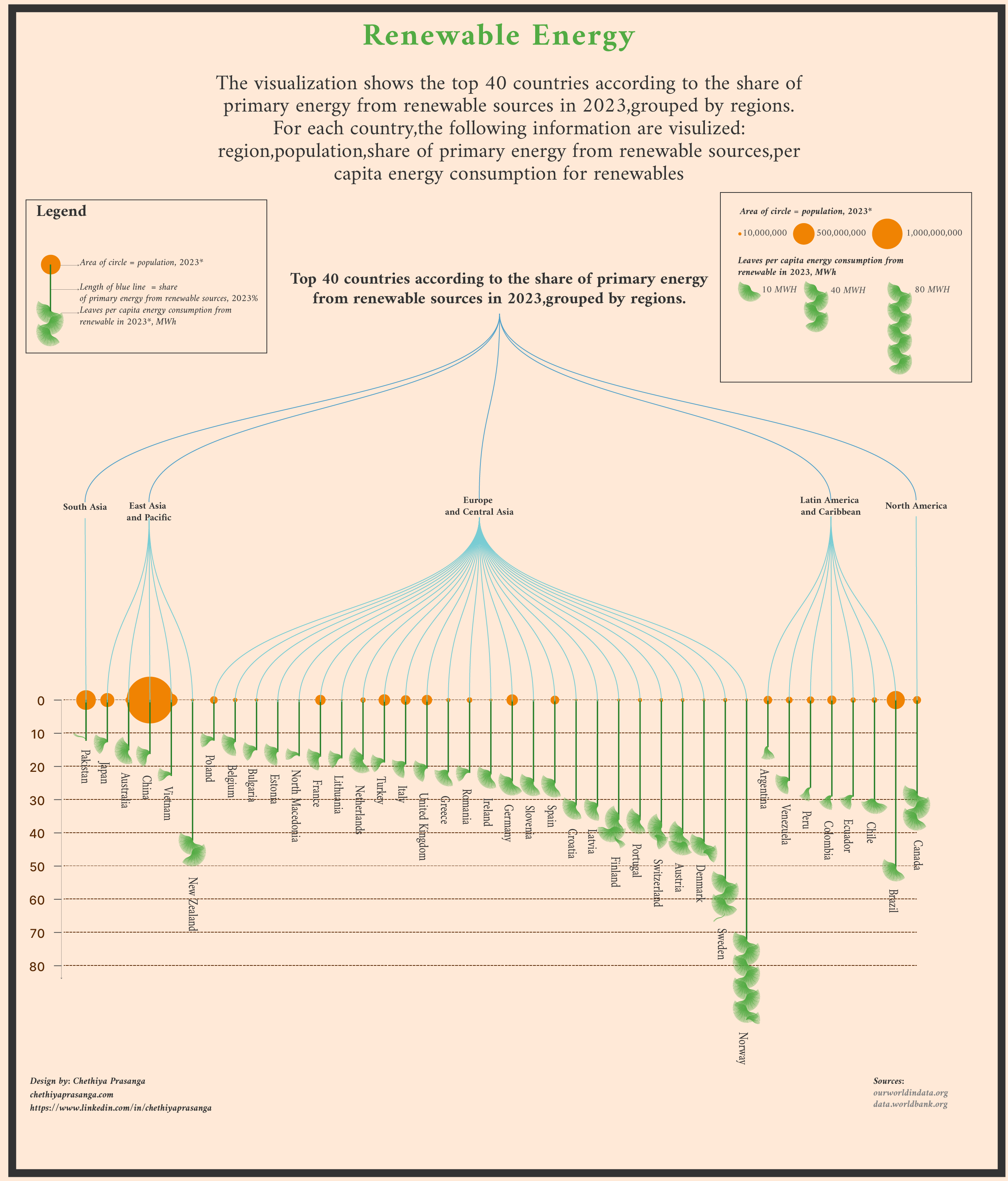
In 2023, renewable energy continues to play a pivotal role in the global transition toward sustainable energy sources. To better understand the dynamics of renewable energy consumption, I developed a data visualization that highlights per capita energy consumption from renewable sources, measured in megawatt-hours (MWh), and correlates it with population size. This visualization uses a creative approach, leveraging leaves and circles to represent the data in an intuitive and visually appealing way.
Concept Development
The goal of this visualization is to present complex data in a way that is both informative and engaging. Here’s how the concept was developed: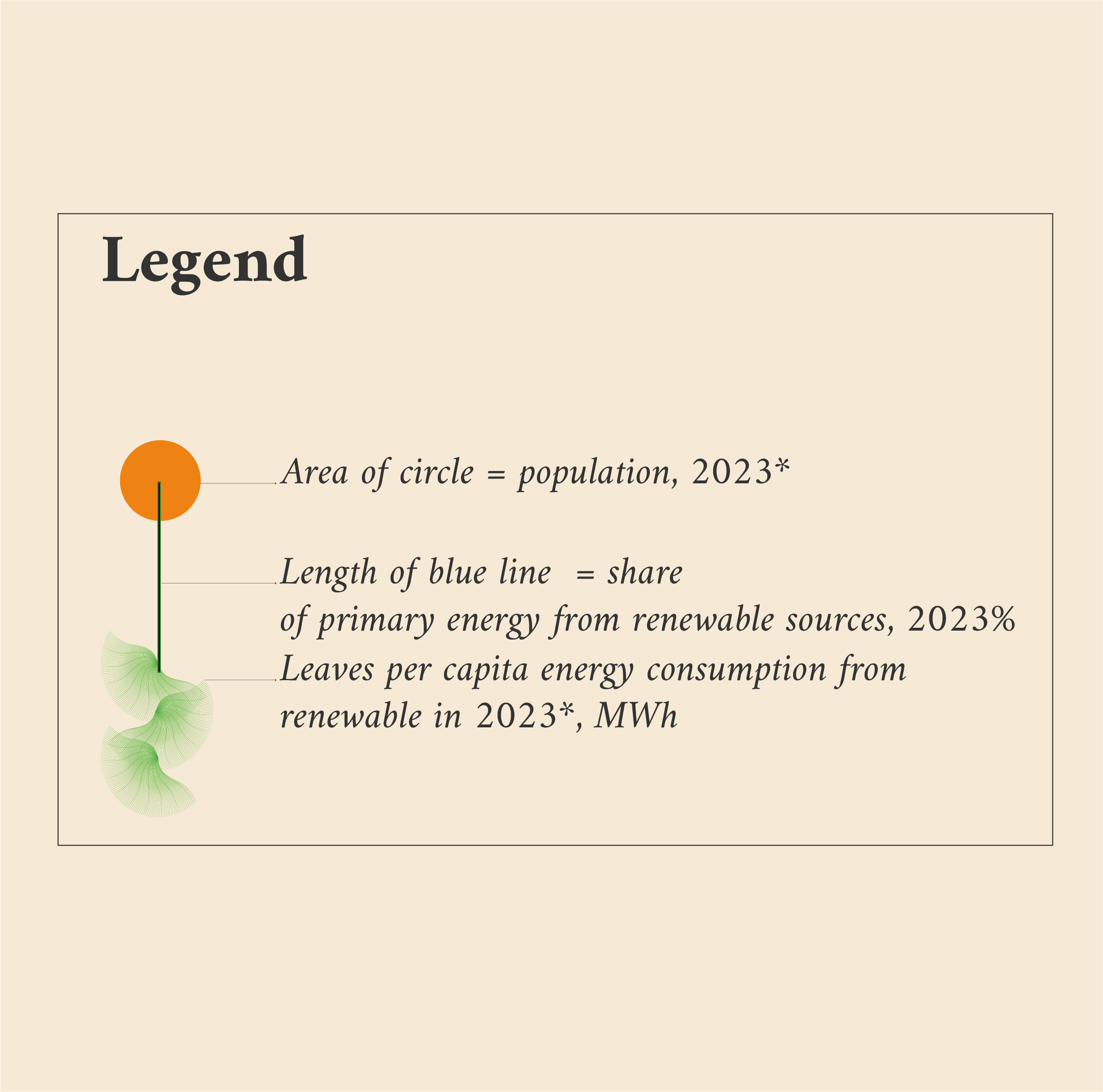
Leaves Representing Per Capita Energy Consumption
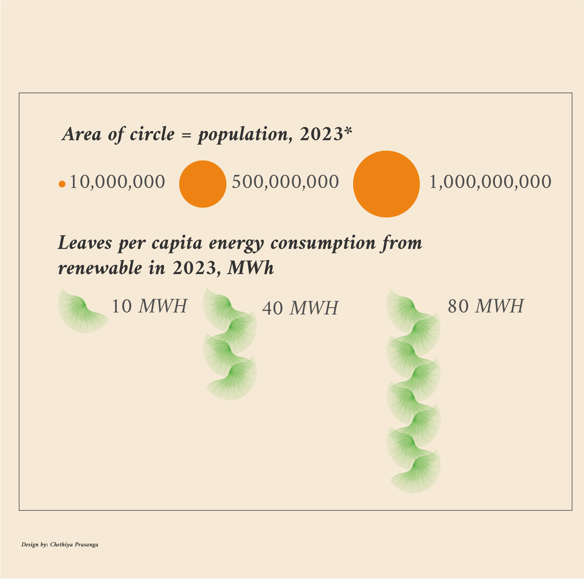
Each leaf in the visualization represents the per capita renewable energy consumption for a specific country or region in 2023. The number of leaves corresponds to the amount of energy consumed per person, measured in MWh. For example:A country with high per capita renewable energy consumption will have more leaves.
A country with lower consumption will have fewer leaves.
Circle Size Representing Population
The size of each circle corresponds to the population of the country or region in 2023. Larger circles represent countries with larger populations, while smaller circles represent those with smaller populations. This helps viewers quickly grasp the scale of energy consumption relative to population size.
Color Coding for Clarity
To enhance readability, the leaves and circles are color-coded based on the type of renewable energy source (e.g., solar, wind, hydro, biomass). This allows viewers to identify which energy sources are most prevalent in each region.
Data Sources and Methodology
To ensure accuracy, the visualization relies on data from reputable sources such as:ourworldindata.org
The World Bank
Key Insights from the Visualization
High Per Capita Consumption in Smaller Populations Countries with smaller populations but high renewable energy adoption, such as Norway, Sweden and Denmark, stand out with a dense cluster of leaves. This reflects their significant investment in renewable energy infrastructure.
Conclusion
This renewable energy data visualization for 2023 provides a unique and insightful perspective on global energy trends. By combining per capita consumption, population size, and energy source types, the visualization offers a comprehensive overview of the state of renewable energy adoption. It also serves as a reminder of the progress made and the work still needed to achieve a sustainable energy future.