Wildfire Data Visualization: A 2024 Perspective
Wildfire Data Visualization: A 2024 Perspective
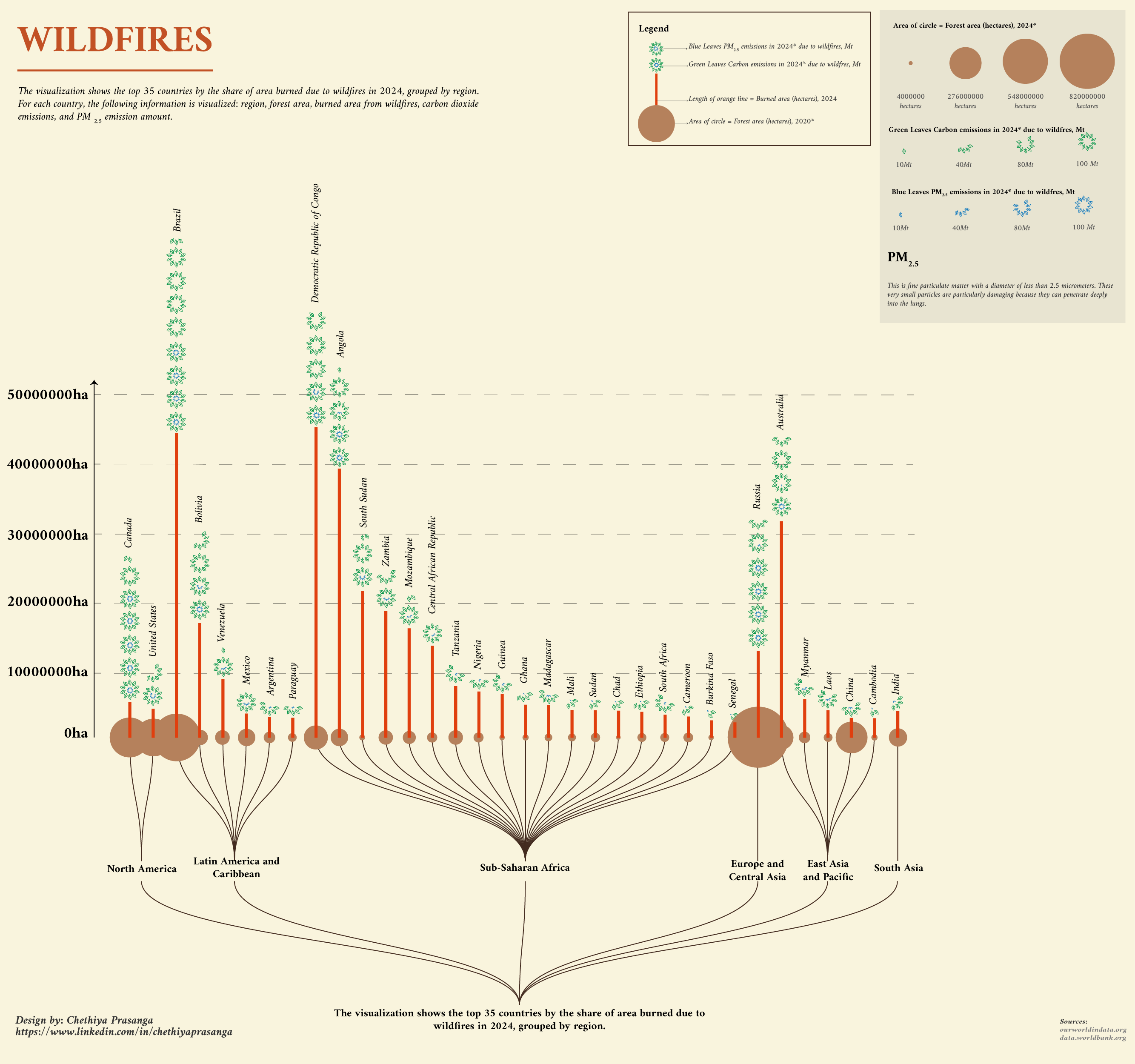
Wildfires have become a growing global concern, with significant impacts on ecosystems, air quality, and climate change. To better understand the scale and effects of wildfires in 2024, I created a data visualization that highlights the top 35 countries most affected by wildfires. This visualization uses a combination of circles, lines, and leaves to represent key metrics such as forest area, burned area, carbon dioxide (CO₂) emissions, and PM₂.₅ emissions.
Concept Development
The visualization is designed to provide a comprehensive overview of wildfire impacts in 2024. Here’s how the concept was developed::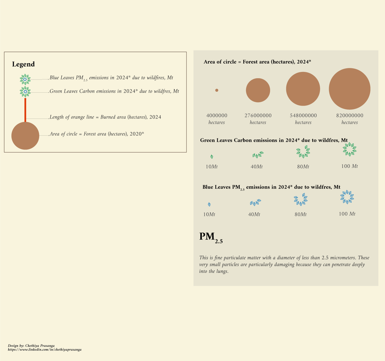
Area of Circle = Forest Area (Hectares), 2020*
The size of each circle corresponds to the total forest area of a country in 2020, measured in hectares. For example: Brazil: 548,000,000 hectares Democratic Republic of Congo: 276,000,000 hectares Australia: 82,000,000 hectaresLength of Orange Line = Burned Area (Hectares), 2024*
The length of the orange line attached to each circle represents the total area burned due to wildfires in 2024, measured in hectares. For example: Brazil: 5,430,000 hectares burned Democratic Republic of Congo: 2,760,000 hectares burned Australia: 820,000 hectares burned Green Leaves = Carbon Emissions in 2024 Due to Wildfires (Mt)* The number of green leaves corresponds to the amount of carbon dioxide (CO₂) emitted due to wildfires in 2024, measured in metric tons (Mt). For example: 10 Mt: 1 leaf 40 Mt: 4 leaves 80 Mt: 8 leaves 100 Mt: 10 leavesBlue Leaves = PM₂.₅ Emissions in 2024 Due to Wildfires (Mt)*
The number of blue leaves corresponds to the amount of PM₂.₅ emitted due to wildfires in 2024, measured in metric tons (Mt). PM₂.₅ refers to fine particulate matter with a diameter of less than 2.5 micrometers, which is particularly harmful to human health. For example: 10 Mt: 1 leaf 40 Mt: 4 leaves 80 Mt: 8 leaves 100 Mt: 10 leaves